Design System That Scales Beyond Figma

OVERVIEW

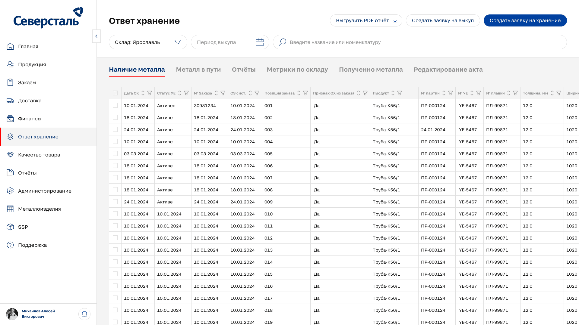
The Severstal Design System transformed a fragmented UI ecosystem into a shared multi-brand product infrastructure used across 40+ enterprise product streams. I led the system architecture and rollout across the design organization, working closely with engineering to standardize tokens, components, themes, and design-to-development workflows. As the system scaled, I also built a custom Figma automation tool to eliminate repetitive token work and reduce maintenance overhead. 40+ product streams 30 designers 40–67% less time on repetitive token workflows* 1 custom Figma automation tool

A laptop with a h32 word on it.
Image of 3 pixelated flat icons

YEAR

2026

ROLE

DESIGN SYSTEM LEAD
PRODUCT DESIGNER

About the project

The problem wasn’t a lack of components. It was scale.

As the company’s product portfolio grew, teams increasingly solved the same UI problems independently.

This created a fragmented ecosystem:

  • product teams maintained their own components and patterns

  • there was no shared token architecture

  • theming and dark mode were implemented inconsistently

  • design and development interpreted the same patterns differently

  • maintaining consistency became increasingly expensive as the organization scaled

What worked for individual teams no longer worked across dozens of products. We needed a shared system that could scale without forcing every product to look identical.

Goals

From UI consistency to product infrastructure

The goal was not simply to create a reusable component library.

We needed a system that could:

Scale across products and brands
Share the same underlying architecture while preserving different product identities.

Reduce repetitive work
Make global changes predictable and eliminate unnecessary manual operations.

Connect design and engineering
Establish one shared model for tokens, components, themes, and states from Figma to production.


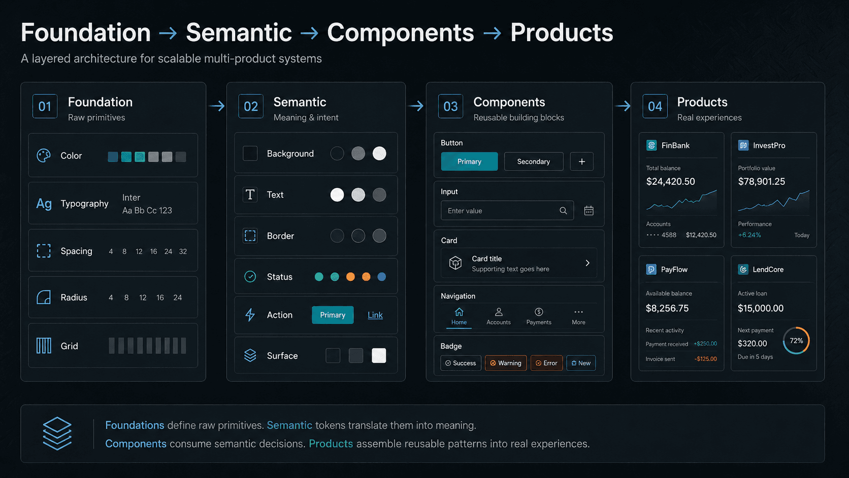
A scalable token architecture

I structured the system around reusable tokens rather than product-specific visual values.

The architecture separated foundational values from semantic product decisions, allowing components to consume shared system logic instead of hard-coded styles.

This made global changes safer, enabled multi-brand theming, and created a common foundation for light and dark modes.

One component system, multiple products

hared components captured common interaction patterns while leaving product-specific visual identity to the token layer.

This allowed teams to reuse behavior, states, and structure without maintaining separate component libraries for every product or brand.

The result was a system that standardized product logic without forcing visual uniformity.


Making design and code speak the same language

The system had to work in production, not only in Figma.

I worked with engineering to align token naming, component behavior, states, and themes with their implementation in Storybook.

This reduced interpretation during handoff and gave design and development a shared source of system logic rather than two parallel representations of the same UI.


When maintenance became the bottleneck, I automated it

As the system grew, token maintenance became one of the most repetitive parts of the workflow.

Instead of treating that overhead as an unavoidable part of maintaining a large design system, I redesigned the workflow itself.

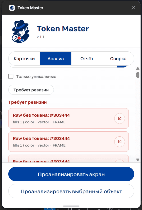
I built a custom Figma automation tool that synchronized token-related work with the development system and removed a significant amount of manual processing.

Internal workflow tests showed a 40–67% reduction in execution time, depending on the task and designer.

More importantly, the tool demonstrated that design-system productivity could be improved through tooling — not only through documentation, processes, or additional headcount.

Outcomes

  • 50% faster design process

  • 35% faster development of new products

  • Unified UI standard across enterprise applications

  • Token-based multi-brand architecture

  • Company-wide dark theme standard

Image of multiple pixelated flat icons
The word "H23" pixelated
Smooth Scroll
This will hide itself!

Design System That Scales Beyond Figma

OVERVIEW

The Severstal Design System transformed a fragmented UI ecosystem into a shared multi-brand product infrastructure used across 40+ enterprise product streams. I led the system architecture and rollout across the design organization, working closely with engineering to standardize tokens, components, themes, and design-to-development workflows. As the system scaled, I also built a custom Figma automation tool to eliminate repetitive token work and reduce maintenance overhead. 40+ product streams 30 designers 40–67% less time on repetitive token workflows* 1 custom Figma automation tool

A laptop with a h32 word on it.
Image of 3 pixelated flat icons

YEAR

2026

ROLE

DESIGN SYSTEM LEAD
PRODUCT DESIGNER

About the project

The problem wasn’t a lack of components. It was scale.

As the company’s product portfolio grew, teams increasingly solved the same UI problems independently.

This created a fragmented ecosystem:

  • product teams maintained their own components and patterns

  • there was no shared token architecture

  • theming and dark mode were implemented inconsistently

  • design and development interpreted the same patterns differently

  • maintaining consistency became increasingly expensive as the organization scaled

What worked for individual teams no longer worked across dozens of products. We needed a shared system that could scale without forcing every product to look identical.

Goals

From UI consistency to product infrastructure

The goal was not simply to create a reusable component library.

We needed a system that could:

Scale across products and brands
Share the same underlying architecture while preserving different product identities.

Reduce repetitive work
Make global changes predictable and eliminate unnecessary manual operations.

Connect design and engineering
Establish one shared model for tokens, components, themes, and states from Figma to production.


A scalable token architecture

I structured the system around reusable tokens rather than product-specific visual values.

The architecture separated foundational values from semantic product decisions, allowing components to consume shared system logic instead of hard-coded styles.

This made global changes safer, enabled multi-brand theming, and created a common foundation for light and dark modes.


One component system, multiple products

hared components captured common interaction patterns while leaving product-specific visual identity to the token layer.

This allowed teams to reuse behavior, states, and structure without maintaining separate component libraries for every product or brand.

The result was a system that standardized product logic without forcing visual uniformity.


Making design and code speak the same language

The system had to work in production, not only in Figma.

I worked with engineering to align token naming, component behavior, states, and themes with their implementation in Storybook.

This reduced interpretation during handoff and gave design and development a shared source of system logic rather than two parallel representations of the same UI.


When maintenance became the bottleneck, I automated it

As the system grew, token maintenance became one of the most repetitive parts of the workflow.

Instead of treating that overhead as an unavoidable part of maintaining a large design system, I redesigned the workflow itself.

I built a custom Figma automation tool that synchronized token-related work with the development system and removed a significant amount of manual processing.

Internal workflow tests showed a 40–67% reduction in execution time, depending on the task and designer.

More importantly, the tool demonstrated that design-system productivity could be improved through tooling — not only through documentation, processes, or additional headcount.


Outcomes

  • 50% faster design process

  • 35% faster development of new products

  • Unified UI standard across enterprise applications

  • Token-based multi-brand architecture

  • Company-wide dark theme standard

Image of multiple pixelated flat icons
The word "H23" pixelated
Smooth Scroll
This will hide itself!

Design System That Scales Beyond Figma

OVERVIEW

The Severstal Design System transformed a fragmented UI ecosystem into a shared multi-brand product infrastructure used across 40+ enterprise product streams. I led the system architecture and rollout across the design organization, working closely with engineering to standardize tokens, components, themes, and design-to-development workflows. As the system scaled, I also built a custom Figma automation tool to eliminate repetitive token work and reduce maintenance overhead. 40+ product streams 30 designers 40–67% less time on repetitive token workflows* 1 custom Figma automation tool

A laptop with a h32 word on it.
Image of 3 pixelated flat icons

YEAR

2026

ROLE

DESIGN SYSTEM LEAD
PRODUCT DESIGNER

About the project

The problem wasn’t a lack of components. It was scale.

As the company’s product portfolio grew, teams increasingly solved the same UI problems independently.

This created a fragmented ecosystem:

  • product teams maintained their own components and patterns

  • there was no shared token architecture

  • theming and dark mode were implemented inconsistently

  • design and development interpreted the same patterns differently

  • maintaining consistency became increasingly expensive as the organization scaled

What worked for individual teams no longer worked across dozens of products. We needed a shared system that could scale without forcing every product to look identical.

Goals

From UI consistency to product infrastructure

The goal was not simply to create a reusable component library.

We needed a system that could:

Scale across products and brands
Share the same underlying architecture while preserving different product identities.

Reduce repetitive work
Make global changes predictable and eliminate unnecessary manual operations.

Connect design and engineering
Establish one shared model for tokens, components, themes, and states from Figma to production.


A scalable token architecture

I structured the system around reusable tokens rather than product-specific visual values.

The architecture separated foundational values from semantic product decisions, allowing components to consume shared system logic instead of hard-coded styles.

This made global changes safer, enabled multi-brand theming, and created a common foundation for light and dark modes.


One component system, multiple products

hared components captured common interaction patterns while leaving product-specific visual identity to the token layer.

This allowed teams to reuse behavior, states, and structure without maintaining separate component libraries for every product or brand.

The result was a system that standardized product logic without forcing visual uniformity.


Making design and code speak the same language

The system had to work in production, not only in Figma.

I worked with engineering to align token naming, component behavior, states, and themes with their implementation in Storybook.

This reduced interpretation during handoff and gave design and development a shared source of system logic rather than two parallel representations of the same UI.


When maintenance became the bottleneck, I automated it

As the system grew, token maintenance became one of the most repetitive parts of the workflow.

Instead of treating that overhead as an unavoidable part of maintaining a large design system, I redesigned the workflow itself.

I built a custom Figma automation tool that synchronized token-related work with the development system and removed a significant amount of manual processing.

Internal workflow tests showed a 40–67% reduction in execution time, depending on the task and designer.

More importantly, the tool demonstrated that design-system productivity could be improved through tooling — not only through documentation, processes, or additional headcount.


Outcomes

  • 50% faster design process

  • 35% faster development of new products

  • Unified UI standard across enterprise applications

  • Token-based multi-brand architecture

  • Company-wide dark theme standard

Image of multiple pixelated flat icons
The word "H23" pixelated
Smooth Scroll
This will hide itself!

Create a free website with Framer, the website builder loved by startups, designers and agencies.