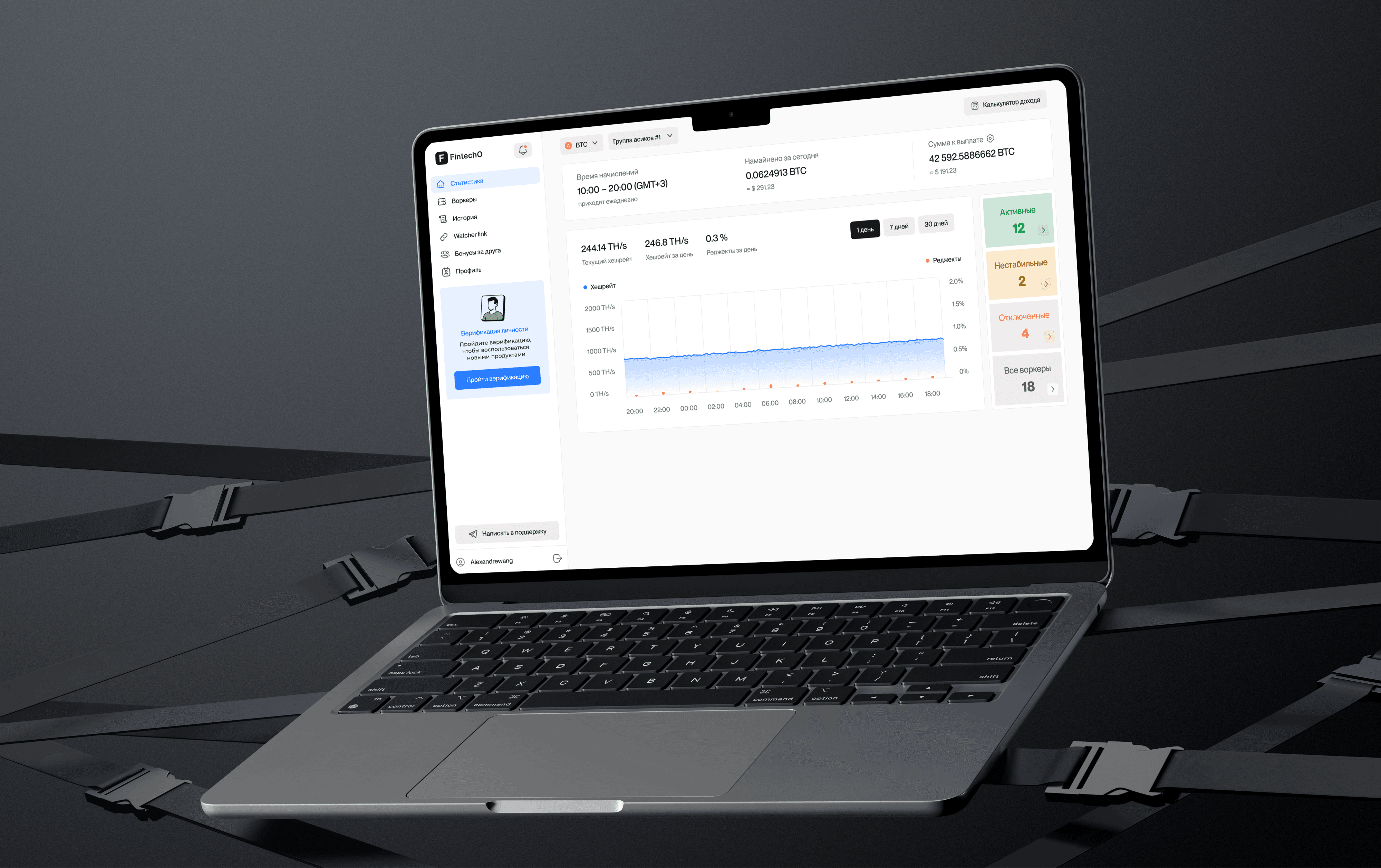
A new business, not a reskin
The company was launching a new business within an established product ecosystem.
While an existing brand and component library provided a useful foundation, the new product introduced different users, business logic, financial operations, and regulatory requirements.
The challenge was to reuse what could accelerate delivery without inheriting assumptions that no longer fit. I owned the product design from product structure and workflow modelling to responsive web, mobile experiences, design tokens, and implementation alignment.
The challenge
The product combined three layers of complexity:
A new business built on inherited foundations
Compliance-heavy tax and KYC/KYB workflows
One product operating across responsive web and mobile
The existing design system could not simply be copied. Every pattern had to be evaluated against new user roles, information density, financial states, compliance requirements, and implementation constraints.
My role
End-to-end product ownership
Working directly with product and engineering, I was responsible for:
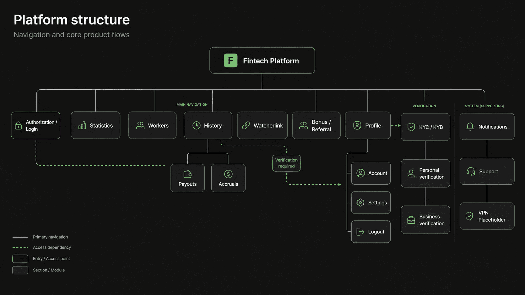
Product structure and information architecture
End-to-end user flows
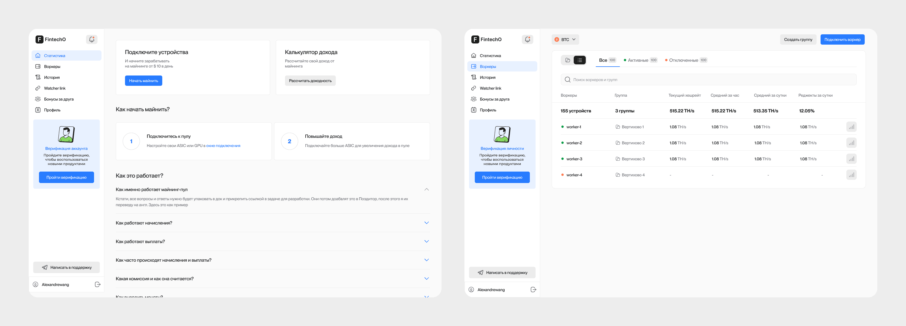
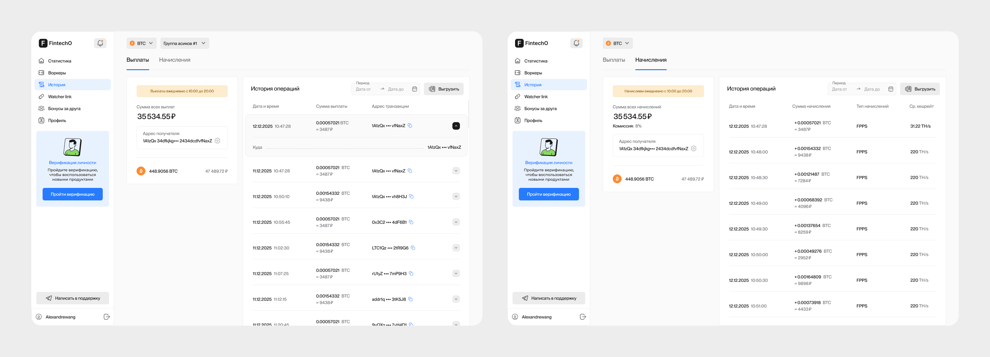
Responsive desktop and mobile web
Dedicated mobile application
UX/UI and interaction patterns
Tax, KYC, KYB, permissions, and financial scenarios
Design-system adaptation and new components
Design tokens, light and dark modes
Component states, edge cases, and recovery paths
Continuous design-to-development alignment
The work was not a collection of individual screens. It was the creation of one coherent product system supporting interconnected workflows, roles, rules, and states.
Key Decisions and Trade-offs
Reuse the Foundation, Redesign the Logic
I treated the existing component library as a set of primitives rather than a finished solution.
Some patterns were retained, others were extended, and new product scenarios received purpose-built components.
Model Rules Before Designing Screens
Tax and verification workflows were mapped as systems of conditions, branches, states, and recovery paths before visual design began.

Share the System, Adapt the Interaction
Web and mobile use the same product logic and visual foundations, while layouts and interactions are adapted to the context of each platform.
Design with Engineering, Not for Handoff
Implementation constraints and system changes were discussed throughout the project, allowing design and engineering decisions to evolve together.
Building the System
A System Designed to Scale
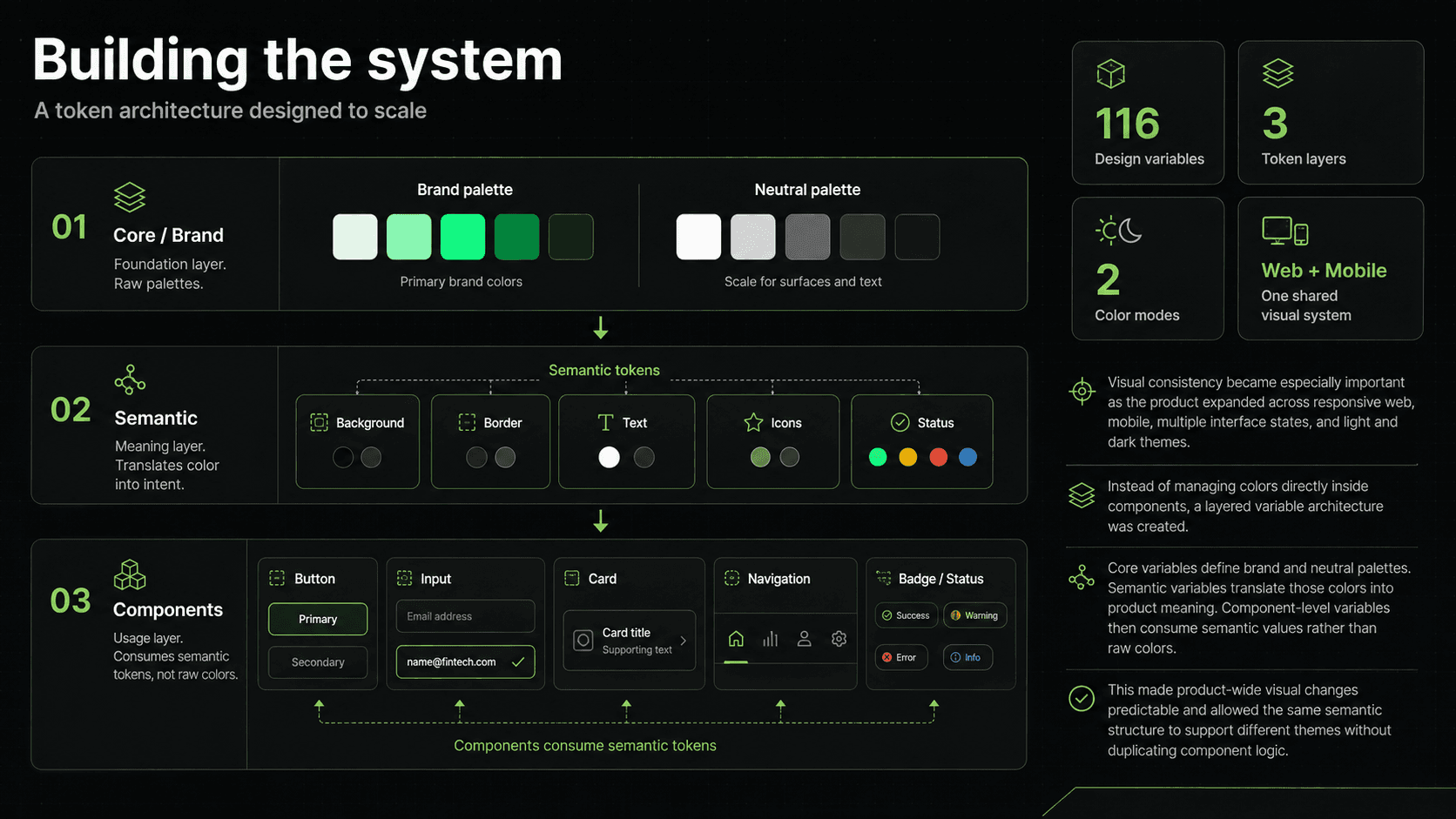
To maintain consistency across platforms, interface states, and themes, I created a layered variable architecture:
Core / Brand → Semantic → Components
Core variables define the brand and neutral palettes.
Semantic variables translate them into product meaning, including backgrounds, borders, text, icons, and status states.
Components consume semantic values rather than raw colours.
116
Design variables
3
Token layers
2
Colour modes
Web + Mobile
One shared visual system
This architecture made product-wide changes predictable and allowed themes to evolve without duplicating component logic.
Designing the Hard Part First
The Interface Wasn't the Difficult Part. The Rules Were.
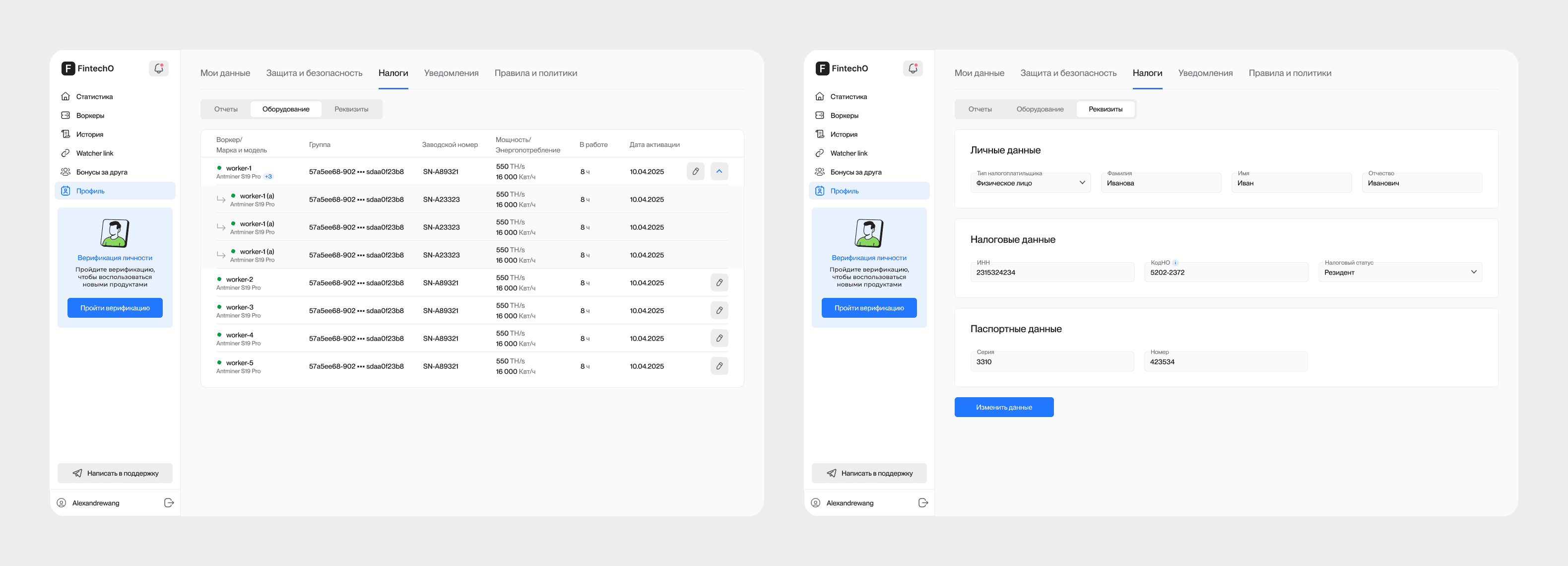
Tax status, business type, documentation, verification results, and previous actions could all change what users needed to provide and what happened next.
Before polishing interfaces, I mapped:
Entry conditions and required information
Branching paths and user roles
Verification and pending states
Errors and missing documents
Re-entry and recovery points
Completion states and next actions
This domain model became the foundation for the final user flows.
Tax Workflows
Making Regulatory Complexity Navigable
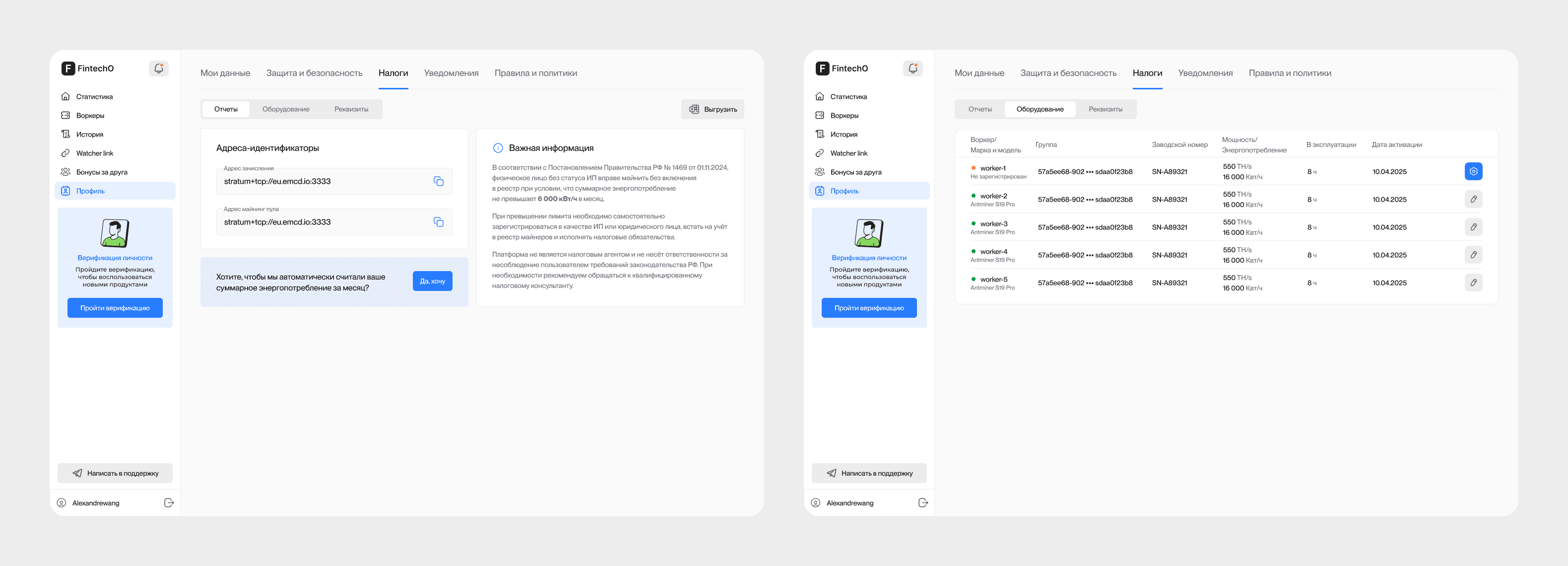
Tax-related processes were divided into explicit stages organised around three questions:
What does the system need from me?
Why is it needed?
What happens next?
Complexity remains available when needed, but the interface progressively exposes only the information relevant to the user's current state.
This turns a dense regulatory process into a sequence users can understand, complete, and recover from.
KYC & KYB
Verification Is a Journey, Not a Screen
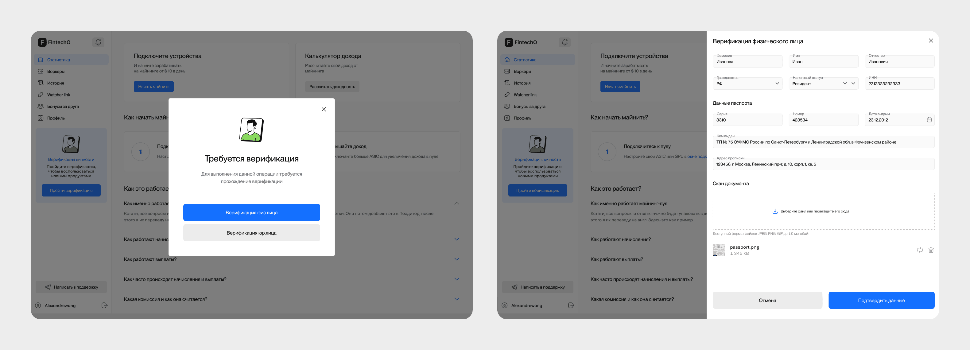
KYC and KYB were designed as complete journeys rather than isolated forms:
Start → Provide information → Upload documents → Review → Pending → Action required → Verified
Individual and business verification require different data, documentation, ownership information, validation rules, and follow-up states.
The system keeps the current status visible and provides a clear next action whenever additional information is required.
The goal was to make compliance feel like a transparent product workflow rather than a black box.
Responsive Web
Designed as a System, Not a Set of Breakpoints
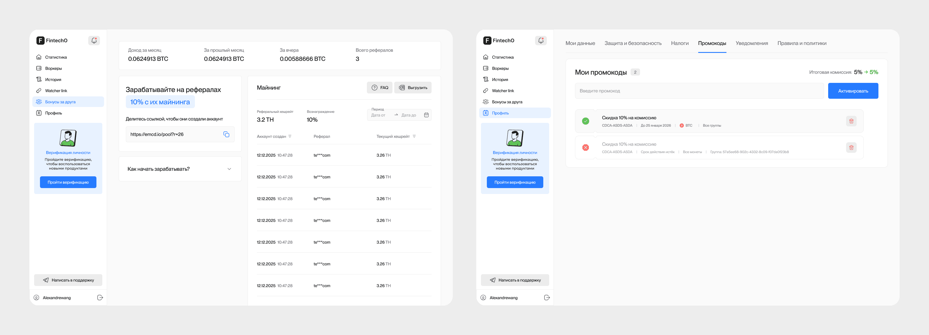
Dense B2B interfaces could not be made responsive by simply stacking desktop content vertically.
Navigation, tables, forms, information hierarchy, and actions were reorganised according to available space and task priority.
The product preserves the same underlying logic while allowing its interface structure to adapt to the user's context.
Dedicated Mobile Experience
Mobile Wasn't Compressed Desktop
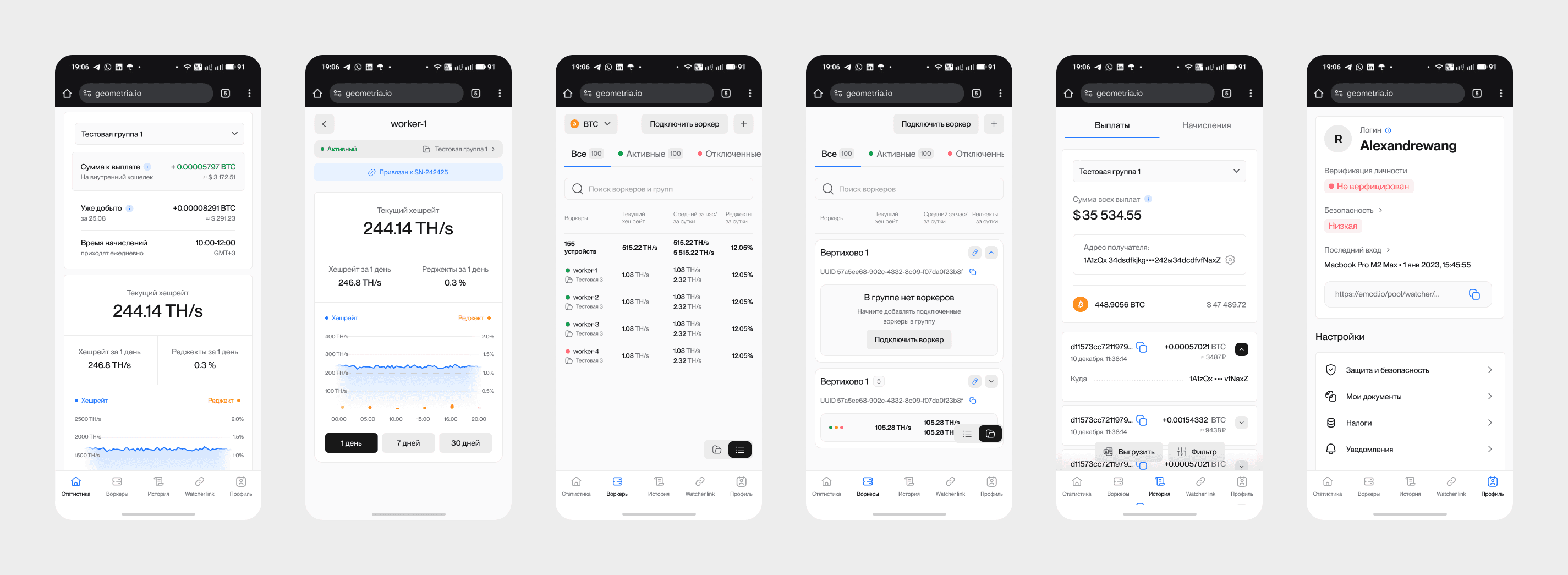
The dedicated mobile experience shares the same product logic and visual foundations but uses interaction patterns designed for:
Touch
Reduced information density
Smaller decision contexts
Navigation depth
Interruptions
Quick status checks and actions
Where necessary, desktop workflows were restructured rather than reproduced.
The result is one product ecosystem expressed appropriately across different surfaces.
Working with Engineering
Implementation Was Part of the Design Process
New components, responsive behaviour, edge cases, system states, and token changes were reviewed with engineering as the product evolved.
Technical feedback shaped both UX decisions and the design system.
The goal was not to create a perfect Figma universe that engineering would later have to reinterpret.
It was to build a product system that could realistically be implemented, extended, and maintained.
Outcome
A Launch-Ready Foundation for a New Business
The project resulted in:
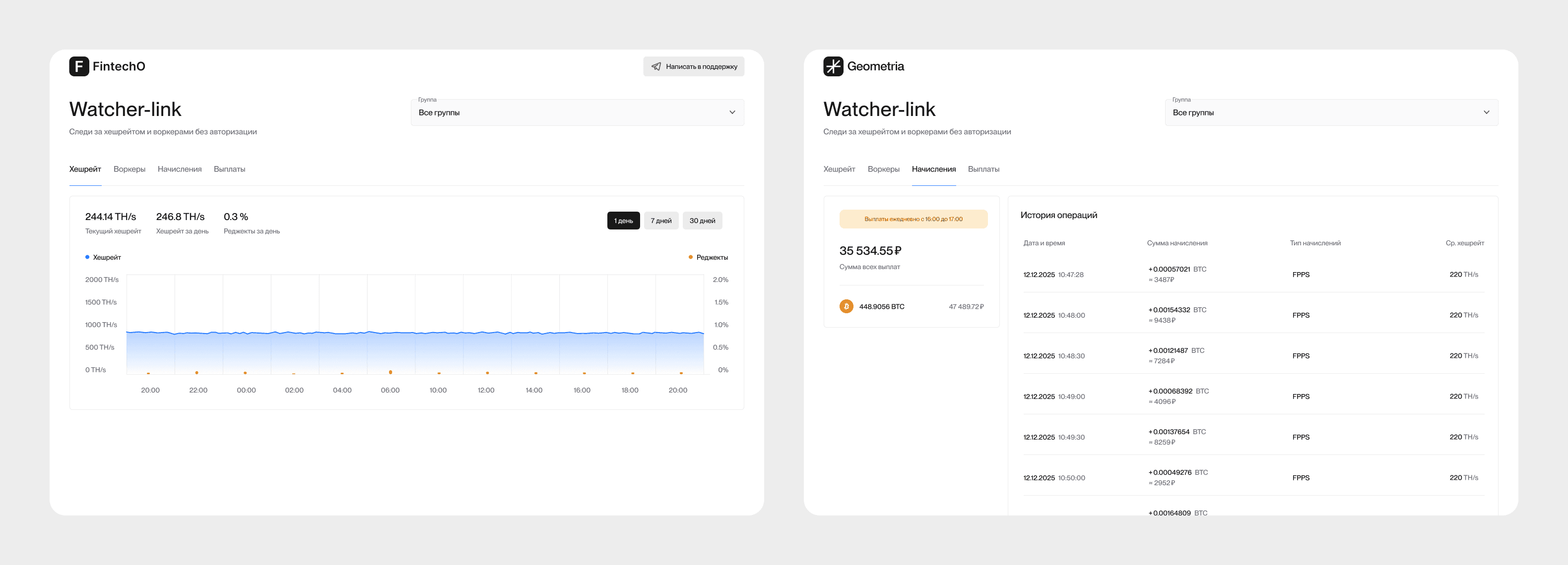
Responsive web platform
Dedicated mobile application
Reusable component foundation
Layered design-token architecture
Light and dark modes
Tax, KYC, and KYB journeys
Financial and operational workflows
Extensive system states and recovery paths
Engineering-aligned patterns ready for continued development
The product is currently preparing for broader launch.
Since it has not yet had enough real-world exposure, I do not attach unverified adoption, revenue, or retention metrics to the case.
At this stage, the measurable outcome is product completeness, workflow coverage, implementation readiness, and a scalable foundation for future development.
What I Learned
Complex B2B Design Is Often Domain Modelling Disguised as Interface Design
This project reinforced three principles:
Existing Systems Should Accelerate Decisions, Not Dictate Them
Reusing a design system is valuable only while the product's actual business requirements remain in control.
Edge Cases Are Part of the Core Experience
In regulated financial products, pending states, verification failures, missing information, and exceptions are not secondary scenarios.
They are the product.
Good System Architecture Compounds Over Time
Tokens, semantic variables, reusable states, and consistent component logic require more discipline initially, but become increasingly valuable as products expand across platforms, themes, roles, and workflows.
Case Study Note
This case study is published with the client's permission.
The company name, brand assets, sample data, colours, and selected visual details have been changed to protect confidential information.
The product structure, workflows, design decisions, and system architecture reflect the real engagement.